


Last Updated on September 18, 2023 by Mayank Dham

In the ever-evolving world of web design and development, CSS (Cascading Style Sheets) continues to be a cornerstone for creating visually appealing and responsive websites. One of the most powerful layout tools that CSS offers is the display grid in CSS property. Grid layouts have revolutionized the way we structure web content, providing a flexible and intuitive way to design web pages.
In this comprehensive article, we will explore the incredible capabilities of the Display Grid in CSS. Whether you’re a seasoned developer looking to master this layout system or a newcomer eager to learn, we’ve got you covered. We’ll delve into the fundamentals of grid layout, its application in real-world scenarios, and best practices for harnessing its potential.
Join us on this journey as we unravel the magic of CSS display grid, allowing you to create stunning and responsive web layouts that adapt seamlessly to various screen sizes and devices.
Basic Grid Syntax and properties:
The basic syntax of CSS Grid consists of the following properties:
- display: grid – This property is used to define the container element as a grid.
- grid-template-columns – This property defines the size and number of columns in the grid.
- grid-template-rows – This property defines the size and number of rows in the grid.
- grid-template-areas – This property allows you to specify named grid areas that can be used to place elements within the grid.
- grid-column and grid-row – These properties are used to place elements within the grid by specifying the starting and ending positions of the grid cells.
Example of Grid
Below is an example of how grid display works. You can make multiple layouts according to your design
Grid Example
Here is an example of how grid display works in CSS.
Box 1
Box 2
Box 3
Box 4
OUTPUT
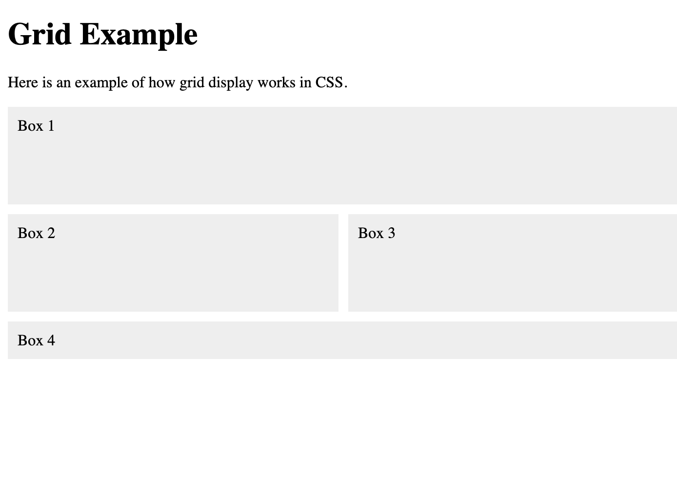
Here div container is given a grid display and its 4 children are designed in the respective layout.
Best Practices for using CSS grid
Here are some of the best practices you can consider while making grid layouts in CSS:
- Plan your grid layout carefully: Before you start coding your grid, plan out your layout on paper or using a design tool to ensure that you have a clear understanding of how you want your elements to be placed within the grid.
- Use descriptive class names: Use descriptive class names for your grid elements to make it easier to identify and modify them later on.
- Keep your code organized: Organize your code in a logical manner, using comments and spacing to make it easier to read and understand.
- Use responsive design techniques: Use media queries and other responsive design techniques to ensure that your grid layout adapts smoothly to different screen sizes and device types.
- Minimize the use of fixed pixel values: Avoid using fixed pixel values for your grid columns and rows, and instead use flexible units like percentages or fractions to make your layout more adaptable.
To make your website impactful you should definitely consider these best practices.
Conclusion
The display grid in CSS has emerged as a game-changer in web design and development. It empowers designers and developers to craft complex, responsive layouts with ease, offering a level of control and flexibility that was once unimaginable. As we conclude our exploration of display grid in CSS, it’s essential to remember a few key takeaways.
Firstly, understanding the basics of grid layout is crucial. Mastery of concepts like grids, rows, columns, and grid items forms the foundation of successful grid-based designs.
Secondly, CSS grid works seamlessly with other CSS features and frameworks. You can combine it with flexbox, media queries, and other techniques to create truly responsive and dynamic web layouts.
Lastly, practice is key to becoming proficient with CSS grid. Experiment with different grid configurations, study real-world examples, and stay up-to-date with the latest developments in grid-related CSS properties.
FAQ (Frequently Asked Questions) Related to CSS Display Grid:
Here are some FAQs related to CSS Display Grid.
1. What is the difference between "display: grid" and "display: flex"?
While both "display: grid" and "display: flex" are CSS layout tools, they serve different purposes. "display: grid" is best suited for two-dimensional layouts, allowing you to create rows and columns, while "display: flex" is designed for one-dimensional layouts, ideal for arranging items in a single row or column. You can often combine these two properties to achieve complex layouts.
2. Is CSS grid supported by all major web browsers?
Yes, CSS grid is widely supported by modern web browsers, including Chrome, Firefox, Safari, Edge, and others. However, it’s essential to test your grid-based layouts on various browsers to ensure cross-browser compatibility.
3. Can I use CSS grid for responsive design?
Absolutely! CSS grid is excellent for responsive design. You can define grid layouts that adapt to different screen sizes and orientations using media queries. This makes it a powerful tool for creating websites that look great on both desktop and mobile devices.
4. Are there any performance considerations when using CSS grid?
CSS grid is generally performant, but like any other CSS property, it can impact performance if used excessively or inefficiently. Avoid creating overly complex grids with unnecessary nesting. Keep your HTML structure semantically meaningful and use appropriate CSS rules to optimize grid performance.
5. Where can I find resources to learn more about CSS grid?
There are plenty of online tutorials, courses, and documentation resources to help you learn CSS grid. Websites like MDN Web Docs and CSS-Tricks offer comprehensive guides and examples. Additionally, experimenting with grid layouts in your own projects is an excellent way to reinforce your understanding and skills.